Introduction to the LED UI Project
About
This project and this website is about making applications for the kind of LED grid (also known as LED Matrix) devices that are available for single board computers or micro-controllers, but you can also them on a normal computer using your normal screen, for example by using ledgrid to emulate an LED grid.
Obviously, this is a whimsical endeavour, and is meant to be fun. A load of weird lights is an entertaining but very niche way to read and interact with a computer.
It might be difficult to write a sequel to War and Peace with this format, but it works quite well for certain simple games as well as: "rain 20 degrees, meeting at 11, don't forget the milk" or whatever you want to be notified about. Even a nice music player could be controlled through an LED grid.
If you are making an application for LEDGrids, I would love to hear about it.
Why are we here?
I realised that my Raspberry Pi Sense HAT, an 8x8 LED Grid, used 25 times less power than my little DSI touchscreen and 50 times less power than my HDMI monitor.
Having spent my whole childhood playing Tetris, my brain is already trained to read coloured blocks from a grid. Therefore I decided to see how far I could push the concept of using an LED grid with a small board computer. Could it replace a desktop computer and monitor in my house (e.g. for notifications and certain other tasks), saving electricity and thus helping the planet?
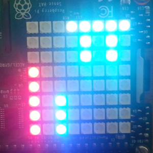
This was my first attempt at an LED grid based notification application.
It aimed to show me a visual summary of my communications while away from my main desk, e.g. on the breakfast table, etc.
The symbol in the top right is telling me that today it will be cloudy with rain (i.e. it is actually meant to be a little picture of a rain cloud).
However, I can cheer up because the two columns of stacked dots are telling me I have five emails in my Gmail and three Twitter notifications.
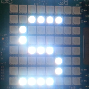
The next logical step was to be able to read email subjects, tweets, etc on the device. So when I selected a dot using a joystick, it would scroll the text across the screen using large letters.
This however was slightly slow and fragile, i.e. if in my impatience, I got bored and moved my gaze away, I could easily lose a few characters and have to wait until it had finished scrolling and then start it scrolling all over again.
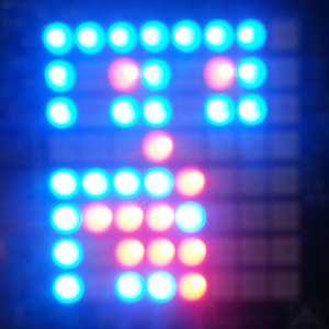
What I really wanted was a way to have several characters on screen at one time. I realised that if each character was encoded in a vertical 4 square block, I could see up to 16 characters on screen at once.
Later, come back and see if you can read this message.
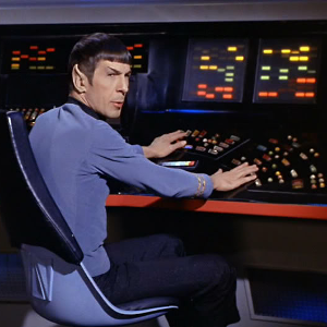
LED UI clearly takes off, especially in the 23rd Century. Enterprise science officer and first officer Spock, has all the information he needs from four colour matrices. No fancy pictures, no talking robots, no holograms.
Incidentally, Matt Jefferies, art director and production designer on the original Star Trek series was a distinguished World War II aviator, and took the concept of 'space navy' seriously in his designs, using military technology and design principles.
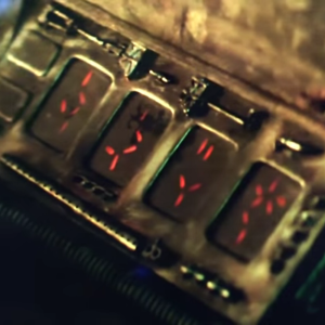
In the Predator movies, the creatures control their masks and weapons using these four little panels. I don't want to spoil the plot, but we can say it is the last display a Predator will ever need.
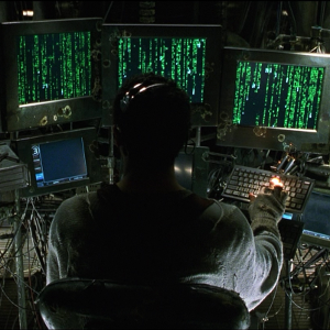
Green Rain from the Matrix films, beautiful if somewhat slightly impractical. These days, even nano can colour source code.